
In an age where digital displays flash at us and social media feeds don’t last long, there is a significant cultural counter-movement. Tactile history, physical artifacts and the feel of nostalgia are attracting consumers with greater and greater interest. In many cases, contemporary minimalist packaging seems cold and impersonal for brands that offer luxury items, specialized literature or heirloom products.
Designed to overcome this emotional divide, designers are turning to the past and combining traditional bookbinding methods with contemporary structural engineering. The packaging style is enchanting, opening like an antique book, thus generating an instant sense of mystery and heritage.
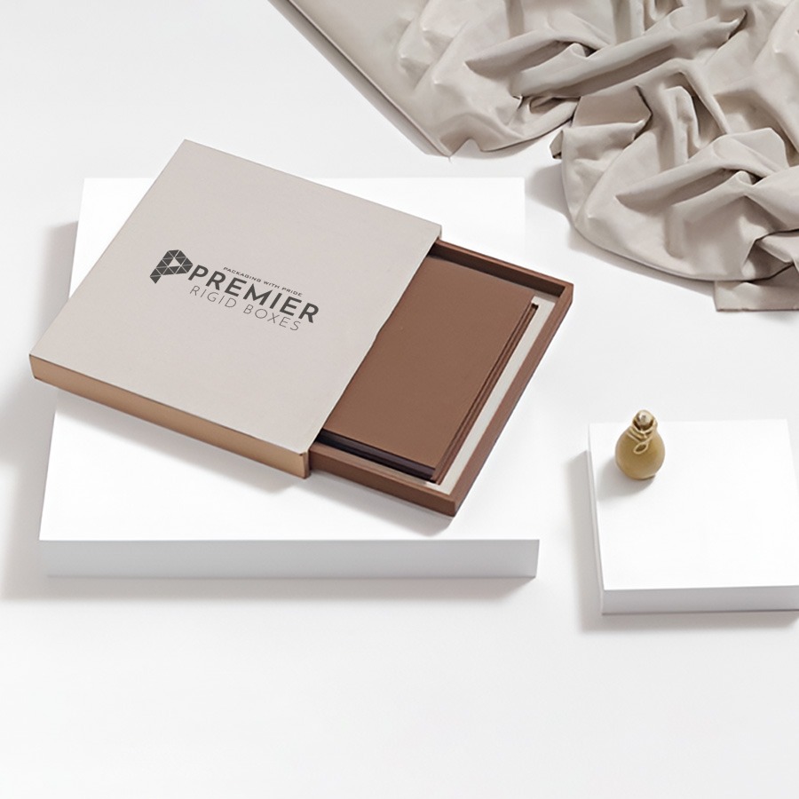
You turn your brand from a retail product into a keepsake with the help of a well-designed Custom Booklet Box to enclose your merchandise.
Architectural Foundation: Anatomy of a Literary Keepsake
There is no such thing as an old-world book with just a vintage print. The look of historical charm isn’t just a matter of a vintage print—it has to be a package that physically emulates the weight, resistance and balance of an old-world book. A three-panel rigid structure is used in this unique structure.
A book type box is formed by an inner structure tray with a wraparound cover, unlike a normal box with a single lid cover. The front face, spine and back lid are composed of the cover pane
+——————+—————–+——————+
| | | |
| Front Cover | Spine | Back Cover |
| (Magnetic) | (Rigid/Curved) | (Glued to Tray) |
| | | |
+——————+—————–+——————+
|
[Internal Product Tray]
To achieve the authentic look of vintage, the material must be carefully chosen:
Heavy Core: The foundation needs to be made using thick, high density grey chipboard. This will keep the walls perfectly straight and heavy, and therefore give the package that unmistakable heavy feel when picked up.
The Tactile Wrap: Do not use high-gloss plastics or glide finishes. Rather, uncoated linen cloth, deep grain kraft or organic cotton-paper combinations that have a textured feel reminiscent of antique vellum or aged calfskin should be used on the exterior.
The Secure Seal: Ancient books used leather straps or brass clasps, but today’s fulfillment demands seamless utility. The high coercive magnets that are embedded in the front lip ensure that the cover snaps shut cleanly against the inner tray.
Creative Design Strategies for Historical Authenticity
Capturing a certain time period calls for a lot of details being considered. You can take your customer to another century altogether by aligning your colors, typography and finishing skills, just as you lift the parcel.
1. The Renaissance Library Aesthetic
Take ideas from 15th century monastic scriptoria. Opt for dark, rich hues, such as burgundy, gold, navy blue or forest green.
Visual Finishing: Use deep blind debossing to impress detailed and interwoven borders into the cover material. Serve up some raised structural ridges (ancient sewn cords), accent with a bit of metallic gold foil to bring your typography to light.
Art Deco Glamour, 1920s, 2
For brands that are more in the jazz-age luxury mood or vintage speakeasies or classic flapper, consider strong shapes and shifts in contrast.
Use crisp black matte paper bases with highly reflective bright metallic gold or platinum foil stamping: Visual Finishing. Emphasize large, symmetrical geometric designs, zig – zag patterns and stylized sunbursts. Complemented by sleek, sans-serif lettering that emanates from a Gatsby mansion.
3. The Apothecary and Botanical Archive
The essence of a 19th-century scientist’s lab or a concealed greenhouse is captured by this style, ideal for organic skin care, herbal teas or artisanal tinctures.
Use raw unbleached kraft paper wraps or soft cream tones as varieties of visual finishing. Print on fine detail lines and in detailed botanical drawings or old copperplate calligraphy. Finish off with a change of foam padding inside for shredded wood wool or nestled linen cushions.
Elevating the Unboxing: The Interior Reveal
This unboxing experience is broken down into two acts in the design, which is inspired by a book. This is an outside cover to hook them and an inside tray to give them the emotional reward.
The left interior of the front flap is an ideal canvas for brands to tell their stories when a customer opens the flap. Fill this space with a beautifully typeset dedication letter, historical map or origin story in an elegant cursive typeface. This makes the task of unpinning a story.
Use custom cut paperboard steps, or trays lined with velvet for the inner tray that holds the product. The box can contain a hidden dual compartment if several items are being packaged, for example a perfume bottle and a small informational catalogue. The upper compartment contains the main product and a small ribbon pull tab that opens up a secondary compartment filled with historical brochures, instructions or certificates of authenticity.
Final Words
Creating a nostalgic packaging design is an investment in emotional connection. The book form resonates with a shared cultural reverence for knowledge, heritage and sumptuous craftsmanship. You’ll be using high quality materials and keep the elegant designs of traditional bookbinders to ensure that your product is not lost in the recycling bin. Your brand story will surely be seen on shelves and mantels by your customers, and continue to be a part of their homes for years to come.