

A modern, mobile-first website is now the front door of a local waste service. Photo: Thirdman via Pexels.
The short answer: Most waste hauling and dumpster rental companies lose customers before a single truck rolls, because their website is slow, hard to use on a phone, and gives no clear way to sign up or request service. The fix is not a flashy redesign. It is a mobile-first site that proves you serve the customer’s area, answers the questions that stop people from booking, and gives them more than one easy way to say yes.
Key takeaways
- The U.S. waste collection industry is roughly an $86 billion market, yet most local haulers still run websites that were built for a desktop-first era.
- More than half of local searches now happen on a phone, and a site that loads in one second can convert far better than one that takes five.
- Online booking is now an expectation, not a perk: 94 percent of consumers say they are more likely to choose a provider that lets them book online.
- Reviews, testimonials, and clear service-area proof remove the objections that quietly kill conversions.
- Localized service pages, built around the exact parishes or cities you cover, capture the “near me” searches that generic pages miss.
The real cost is the revenue you never see
Waste hauling is not a glamorous business, but it is a large and steady one. IBISWorld puts the U.S. waste collection services market at about $86 billion in 2025, and Grand View Research expects the broader waste management market to keep growing at roughly 5 percent a year through 2030. Demand for residential, commercial, and roll-off service keeps climbing with new construction and household growth. The customers are out there. The real question is simple: is your website set up to catch them?
Most owners do not think about their website until the pain shows up. A caller says they could not find your service area. Your Google rating is strong, but the phone still does not ring enough. You are paying for ads, but the page they land on does little to turn a click into a customer. Across local service businesses, the same friction points appear again and again:
- No clear way to sign up or request service online, so the customer has to call during business hours or give up.
- No proof of where you actually operate, so a homeowner two parishes over cannot tell if you serve them.
- A broken experience on mobile, even though most people are searching from a phone.
- No visible trust signals, so a first-time visitor has no reason to believe you show up on time or clean up after yourselves.
- Generic copy that could describe any hauler in any state, and says nothing about why you are the local choice.
The math is simple and uncomfortable. Say your service area produces 100 organic searches a month for garbage pickup or dumpster rental. If a poorly built site converts 2 percent of them, you get two leads. A competitor with a fast, clear, trustworthy site that converts 5 percent gets five. Over a year, that is 36 customers you never met, on top of the paid-ad budget you burned sending traffic to a page that could not close.
The six things a high-converting hauler website needs
A website that converts for a waste company looks different from a corporate brochure site. Service buyers have specific worries, and removing them is the entire job of the design.
1. Mobile-first speed
Your typical customer is searching on a phone, often early in the morning or right after a missed pickup. Speed decides if they stay. Portent’s analysis of millions of sessions found that a site loading in one second can convert roughly two to three times better than one that takes five seconds. Google has separately confirmed that Core Web Vitals are used by its ranking systems. A slow site loses on visibility and on conversion at the same time.
The effect is measurable in fractions of a second. A joint study by Google and Deloitte found that shaving just a tenth of a second off mobile load time lifted conversion rates by more than 8 percent. As a page drags from one second toward five, the odds that a visitor gives up and leaves climb sharply. For a hauler, that lost visitor was a customer looking to sign up.
Mobile-first means three things working together: the page loads in under two seconds even on a cellular connection, buttons and forms are large enough to tap without zooming, and the most important information sits above the fold. Before scrolling, a visitor should see where you operate and one obvious next step.
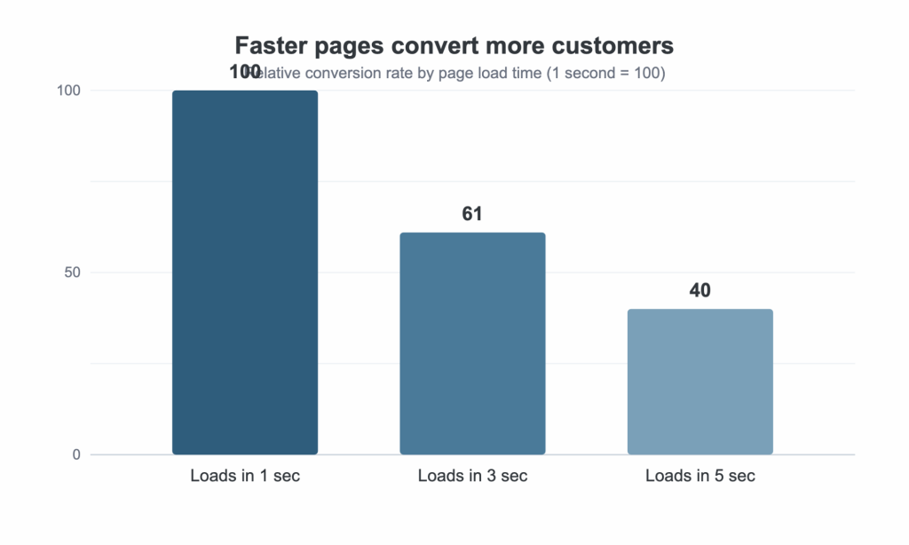
Source: Portent, “Site Speed Is Hurting Everyone’s Revenue,” 2022. Values indexed to the one-second load time.
2. Proof of where you actually operate
Waste service is hyperlocal. A homeowner in one parish does not care how good you are in the next one over. Your site has to prove, fast, that you serve their address. That means a clear service-area section on the homepage, a simple way for a visitor to confirm their location is covered, and dedicated pages for each area you serve instead of one catch-all page.
Those localized pages do double duty. They answer the visitor’s first question, and they rank for the searches people actually type, like “garbage pickup” or “roll-off dumpster rental” paired with a city or parish name. One documented localization case study reported a 502 percent increase in organic traffic after moving from generic pages to location-specific ones. Results vary, but the principle holds: match the page to the search.
The payoff is intent. Google’s research on “near me” searches shows that most people who look for a nearby business on their phone visit one within a day, and a solid share of those searches end in a purchase. When someone in your area searches for pickup or a dumpster and lands on a page built for their town, you are catching them at the exact moment they are ready to act.
3. A clear path to sign up, not a phone number buried in the footer
You do not have to publish exact prices online, but you do have to signal that you are organized and easy to work with. A prominent “Sign Up” or “Request Service” button, a short quote form that captures the address and service type, and a visible service menu all beat a lonely “call for pricing” line at the bottom of the page. The goal is to let a ready customer act the moment they decide, without waiting for business hours.
4. Trust signals that answer the unspoken objections
Every first-time customer is quietly asking the same things. Are you reliable? Will you show up on time? Are you insured if something goes wrong? Your website should answer those before anyone has to call. Reviews carry enormous weight here. BrightLocal’s 2024 survey found that 75 percent of consumers regularly read online reviews for local businesses, and half trust them as much as a personal recommendation. The same survey found that 88 percent would use a business that replies to all of its reviews, versus under half for one that ignores them, so answering reviews is part of the design job too. Real testimonials, a visible star rating, insurance and licensing badges, and photos of your crews and equipment in action all turn a stranger into a believer.
5. More than one way to say yes
Different people prefer different channels, so give them options: an online sign-up or request form, a one-tap click-to-call button on mobile, a bill-pay link for existing customers, and a text option for quick questions. Online booking in particular is no longer a nice-to-have. A GetApp survey found that 94 percent of consumers are more likely to choose a provider that offers online booking, and most would rather book online than pick up the phone. Meanwhile, a Zoho Bookings survey found that about 57 percent of small businesses still schedule everything by phone, which is exactly the gap a smart hauler can exploit.
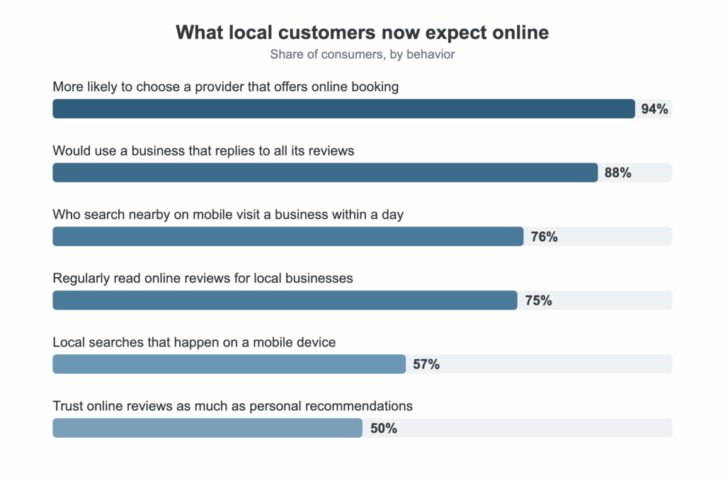
Sources: GetApp (2021), BrightLocal Local Consumer Review Survey (2024), Think with Google, ReviewTrackers.
6. Content that keeps earning traffic
A well-built site can only capture the searches it ranks for. A simple blog and FAQ section widen that net by answering the questions customers already ask: how pickup scheduling works, what fits in a given dumpster size, what happens if a pickup is missed, or if you handle apartments and job sites. Each helpful page can rank for several related searches and keep bringing in leads long after it is published. Publishing one useful article a month, focused on customer questions rather than company news, compounds over time.
Case study: how a redesign helped Trash Rangers turn its website into a real front door
Trash Rangers is a locally owned waste and sanitation company based in St. Amant, Louisiana, serving Greater Baton Rouge, Ascension, Livingston, and the surrounding parishes. Their range is broad: residential, commercial, and industrial garbage collection, roll-off dumpster rentals, bulk trash pickup, and portable sanitation like restroom and handwash station rentals. Their promise to customers is refreshingly plain, “always local, always upfront.”
When BlakSheep Creative took on the project, the challenge was familiar. Trash Rangers offered a lot of services across multiple parishes, but the old site made it hard for a visitor to quickly find the right service for their address and take the next step. The work was not about making the site look flashy. It was about making it clear, fast, and easy to act on.
What the redesign focused on:
- Localized service pages for the parishes Trash Rangers covers, so a visitor in Livingston or Ascension lands on content that speaks to their area instead of a generic catch-all page.
- An interactive service-selection tool that lets a visitor browse residential, commercial, and industrial options and move toward signing up without a phone call.
- A mobile-responsive rebuild that works cleanly on the phones most local customers actually use.
- SEO-optimized content structured around the services and locations people search for.
- Integrated customer testimonials to build trust for first-time visitors comparing options.
Since the new site launched, Trash Rangers has seen the kind of results a redesign is supposed to deliver: stronger engagement and conversion, more organic traffic with visitors staying longer instead of bouncing, and more service inquiries coming in through clearer navigation. The client feedback has been positive. You can see the full breakdown in the Trash Rangers website redesign case study.
The lesson generalizes to any hauler. None of these moves required inventing a new service or spending big on advertising. They removed friction. A customer who can find their parish, understand the service, and sign up in a couple of taps is a customer you keep.
How to start: five practical steps
You do not need to rebuild everything at once. Start here.
1. Audit your own site on your phone
Open your website on your phone and be honest. Does it load in under three seconds? Can you quickly tell which areas you serve? Can you sign up or request service in one tap? Do you see reviews or proof of real work? Every “no” is a leak.
2. Map your services and areas
List every service you offer and every parish or city you cover. Each meaningful combination deserves its own page with real, specific copy rather than one page trying to do everything.
3. Gather your proof now
Collect Google reviews, testimonials, photos of your trucks and crews on the job, and any licensing or insurance credentials. This is the most persuasive content you have, and you can start assembling it today, even before a redesign.
4. Make mobile the baseline, not an afterthought
If you work with a designer or agency, make mobile-first performance a hard requirement. Use your own analytics to see how phone visitors behave, and insist the site be fast and easy to act on for them first.
5. Add an online sign-up or request form
Even a simple form that captures the address, service type, and best time to reach the customer beats “call for a quote.” Removing the phone-call requirement is one of the highest-leverage changes a local hauler can make.
How to know your new site is actually working
A redesign is only worth it if you can see the return, so decide what you will track before the new site goes live. Four numbers tell the real story, and none of them require guesswork.
- Organic leads per month. Watch how many inquiries come from search, using Google Analytics and Search Console. This number should climb as your location pages get indexed.
- Conversion rate. Divide the leads you get by the visitors you receive. A stronger site turns more of the same traffic into customers, so this rising is a sign the design is doing its job.
- Mobile load time and Core Web Vitals. Check these in Google’s free tools. If the site is slow on a phone, fix that before anything else, because it caps everything downstream.
- Cost per lead on paid ads. When your landing pages are faster and clearer, the same ad budget produces more leads, so your cost per lead should fall.
Set a baseline the week before launch and check again at 30, 90, and 180 days. That cadence separates a redesign that paid off from one that only looked nicer.
The window is open, but it is closing
More than half of small businesses still lean on the phone as their main way to book work, even as customers increasingly expect to handle things online. That gap is the opportunity. The haulers who offer online sign-up, clear service-area proof, and a fast mobile experience will take share from the ones still asking every customer to call during office hours. The tools are affordable, and the payback is quick. The only real cost is waiting.
Common questions about websites for waste hauling companies
How much should a professional website for a waste hauling company cost?
A purpose-built site, rather than a bare template, generally runs a few thousand dollars, depending on how many service and location pages you need and on the sign-up or scheduling tools you integrate. The right way to judge the cost is against the customers a better site brings in. Either a single recurring commercial account or a steady flow of roll-off rentals can quickly cover the investment.
Do I have to build location pages for every area I serve?
If you serve more than one city or parish, yes. A dedicated page for each area you cover matches the exact “near me” searches customers use and gives you a real shot at ranking for them. One generic page rarely ranks well for any single location.
How fast should my site load?
Aim for under two seconds, especially on mobile. Speed affects both your search visibility and how many visitors stick around long enough to become customers, and the biggest drop-off happens in the first few seconds of load time.
How long until a redesign shows results?
Improvements tied to the experience itself, like a faster site and an easier sign-up flow, can show up within weeks. Organic search growth takes longer, usually a few months, because search engines need time to crawl, index, and rank new pages.
Should I handle the website myself or hire a pro?
You can build a functional site yourself with a website builder if you have the time and patience. An experienced agency tends to move faster, build a faster-loading site, and integrate sign-up and review tools without the friction that trips up do-it-yourself builds, because conversion is the work they do every day.
How do I measure results after a redesign?
Track four things: organic leads per month from search, your conversion rate (leads divided by visitors), mobile load time, Core Web Vitals, and your cost per lead on paid ads. Set a baseline before launch and compare at 30, 90, and 180 days. Together, these show if the site is bringing in more customers, not just looking better.
The bottom line
Waste hauling is a large, steady, growing business, but customer acquisition on most competitor websites still moves at a decade-old pace. A site designed around your customer, fast, mobile-first, honest about where you operate, backed by real proof, and easy to act on, is no longer a luxury. It is the baseline that separates the haulers who grow from the ones who stall. Your next customers won’t hunt for a phone number. They are going to land on your site, confirm you serve their address, and sign up in under a minute. Build for that, and you will win more of them.
By Clint L. Sanchez, BlakSheep Creative
About BlakSheep Creative
We are a Louisiana web design and SEO agency that helps local service businesses turn online searches into customers. We have worked with waste haulers, home service companies, and other local operators to build fast, mobile-first websites that convert. The Trash Rangers redesign referenced above is one example of that work.
