
A map on the wall is never only a map.
It looks like geography, but it behaves more like a portrait. It shows where we have been, what we understand, what we long for — and sometimes what we want others to think we understand. For more than five centuries, people have hung maps in homes, offices, libraries, and studios not simply to find places, but to locate themselves.
That is why world map art has survived so many shifts in taste. We have moved from hand-coloured wall maps to printed atlases, from maritime charts to satellite imagery, from globes to the phone in your pocket — and still the urge to put the world on a wall remains. Renaissance merchants did it. Dutch collectors did it. Vermeer painted it. Today, travellers mark visited countries with pins. The format keeps changing; the impulse barely does. We are turning space into identity.
When knowledge became status
The modern habit of displaying maps has deep roots in the commercial life of early modern Europe. In the sixteenth and seventeenth centuries, the Low Countries became one of the great hubs of European trade, and that wealth created an appetite for printed maps, atlases, globes, and wall maps. The Osher Map Library describes the era as both a golden age of Dutch and Flemish mercantilism and of cartography — the same money that moved tea, sugar, and cotton across the continent also funded the mass consumption of cultural goods.
Usefulness alone never explained the appeal. Large wall maps hung in the offices of merchants, shipowners, and wealthy citizens because they projected command over information. A person who owned a map of the world looked connected to the world. A person who owned the newest map looked connected to the newest world.
The University of Chicago’s History of Cartography notes that Dutch wall maps were prized across the higher social classes, though few survive — mounted on walls, they were exposed to sun, damp, smoke, and constant handling. Publishers even printed dedicated wall-map sections in their catalogues, letting buyers choose the world, a continent, a single country, or their own province, often with decorative borders.
The point is simple: the wall map was never merely informational. It was expensive, social, and quietly performative.
The world as theatre
In 1570, Abraham Ortelius published Theatrum Orbis Terrarum — “The Theatre of the World” — in Antwerp. The original Latin edition gathered seventy maps across fifty-three sheets, and it ran to thirty-one editions in seven languages before 1612.
The title tells you everything. Ortelius did not call his work a manual or an index. He called it a theatre. To open it was to step into a curated performance of global knowledge.
That theatrical quality is exactly why old maps still feel decorative. They are compositions, not diagrams. They have hierarchy, rhythm, typography, sea monsters, ships, scale bars, coats of arms, and elaborate title panels. They don’t just say this is where things are. They say this is how the world can be seen.
Nowhere is that clearer than in the cartouche — the ornamental frame around a map’s title, maker, or dedication. Cartouches behaved like miniature paintings tucked inside the map: scrollwork, allegorical figures, local animals, trade goods, royal arms. They turned a neutral surface into a story. This is why vintage world map wall art still works so beautifully in a room today. The decorative structure was built into the genre from the very beginning. These were never minimalist data graphics — they were designed to hold a wall.
Every map is an argument
Gerardus Mercator is remembered for his projection, but his real lesson is larger. His 1569 world map let latitude and longitude meet at right angles so sailors could plot straight routes — at the cost of wildly enlarging the landmasses near the poles.
In other words, every map chooses. It preserves direction and sacrifices scale, or centres one region and shrinks another. A map is never a mirror of the world; it is a designed version of it. To hang one is to hang a worldview.
By the next century, Dutch atlas-making had become an outright luxury industry. Joan Blaeu’s Atlas Maior, published from 1662, ran to eleven volumes and around 600 maps. An uncoloured copy cost 350 Dutch guilders; a coloured one, 450 — making it one of the most precious books of its age. It was scholarship and status at once. I have access to the world, it said, and the taste to own it beautifully.
Modern map prints inherit that double life. A large world map in a study can feel analytical and aspirational. A vintage city map can feel historical and intimate. A push-pin map can feel like memory made visible.
Vermeer and the domestic wall
Few artists captured the meaning of the wall map better than Johannes Vermeer, whose interiors are often read as a perfect record of cartography’s popularity in the Dutch Golden Age. The detail worth noticing is this: Dutch publishers sometimes reissued older maps purely for decoration. Some maps were valued not because they were current, but because they simply looked right on a wall.
That is precisely how map art still works. Someone buying a vintage-style world map today isn’t trying to cross the Atlantic. They are choosing atmosphere, learning, ambition, and identity. The map has become a cultural object.
The psychology of owning space
So why does a map on the wall feel so satisfying?
Part of the answer is place identity — the way physical environments become bound up with the self. A 2020 review in Frontiers in Psychology frames it as a dimension of personal identity formed through the ideas, feelings, values, and goals we attach to places.
A wall map makes that relationship visible. It shrinks the abstract scale of the world down to a personal surface, and the places become symbols. A hometown becomes origin. A country becomes memory. A route becomes achievement. A future destination becomes intention.
This is why push-pin travel maps feel so emotionally direct. Each pin is tiny, but it performs a powerful act: I was there. I want to go there. This mattered to us. The pleasure isn’t only nostalgia — it’s authorship.
From Dutch merchants to push-pins
The line runs straight from the merchant to the traveler. The merchant’s map said: these are the routes, ports, and markets that shape my world. The push-pin map says: these are the cities, memories, and journeys that shape mine. Both turn geography into identity. Both use the wall as a private stage made public.
That is why map art settles so naturally into home offices, living rooms, hallways, and creative studios. Unlike an abstract print, it invites conversation. Unlike a photograph, it can hold many memories at once. Unlike a poster, it grows more meaningful over time.
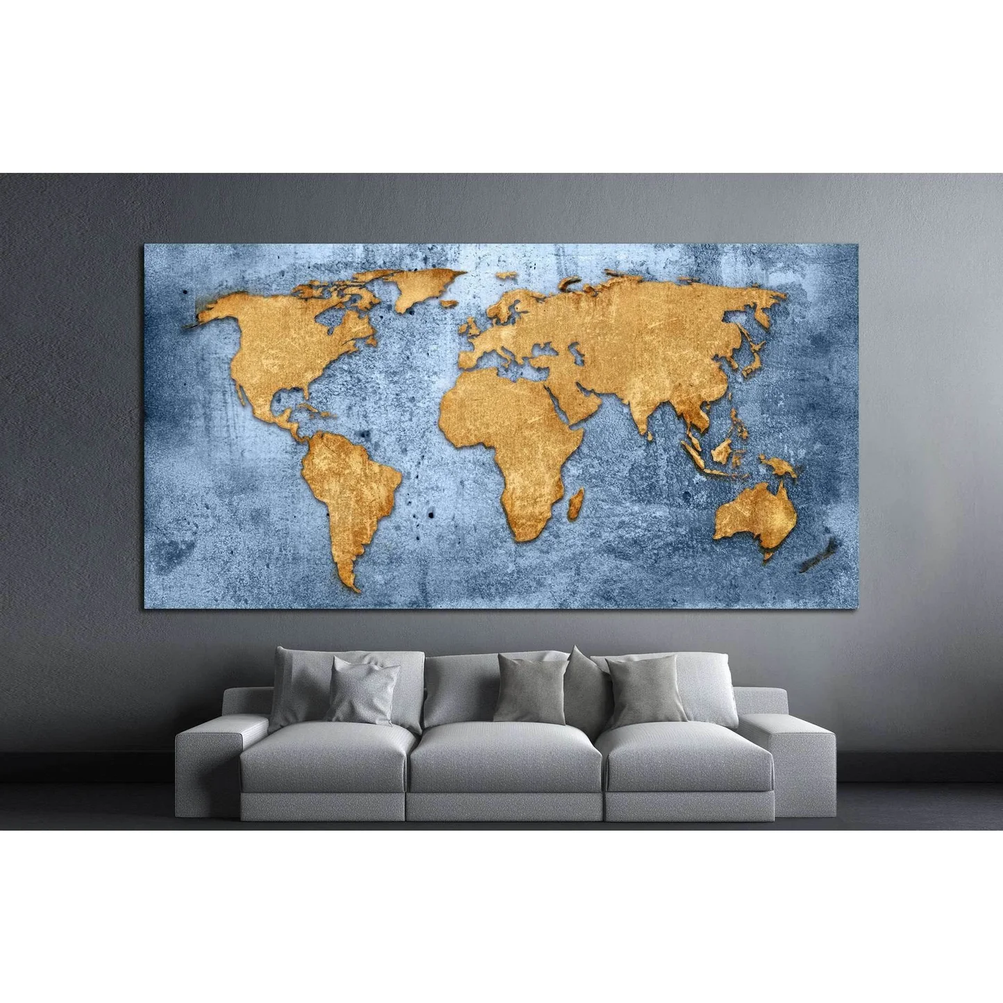
And it reads as current, not old-fashioned. Etsy’s 2026 trend reporting points to an “Everyday Exhibits” mood — shoppers building genuinely personal galleries at home — while Houzz’s design coverage describes a hunger for spaces that feel warm, calming, and built to last. Map prints belong squarely in that movement. A softer, painterly piece by Zellart like watercolour world map wall art from can carry the same sense of place while feeling modern and quietly artistic rather than scholarly.
The map is still a declaration
A map on the wall has always said more than here is the world.
In a trading house it meant knowledge, access, ambition. In a Dutch interior it meant learning, taste, prosperity. In a modern home it can mean memory, movement, curiosity, belonging — or plans not yet finished.
That is the real reason we keep hanging maps. We are not decorating with geography. We are arranging our relationship to the world: where we have been, where we imagine ourselves going, and how wide we believe that world can be.