

Why First Impressions Matter in App Listings
When users discover a mobile app, they rarely make a download decision based on the app name alone. They scan the icon, title, rating, short description, and most importantly, the screenshots. In many cases, app store screenshots become the visual bridge between curiosity and action. They show users what the app looks like, how it works, and why it deserves space on their phone.
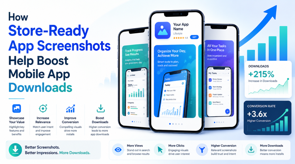
From a listing growth perspective, screenshots are not just decorative assets. They are conversion tools. A strong visual set can explain value faster than a long description, especially when users are comparing several apps in the same category. If your mobile app screenshots look clear, polished, and useful, they can make the app feel more trustworthy before the user even taps the download button.
This is where store-ready app screenshots become important. They are designed with platform requirements, user psychology, visual clarity, and messaging in mind. Instead of simply uploading raw screen captures, app owners can present a guided visual story that helps users understand the app in seconds.
What Store-Ready App Screenshots Really Mean
Store-ready app screenshots are visuals prepared specifically for app marketplace listings. They are sized correctly, visually consistent, easy to read, and aligned with the expectations of App Store and Google Play users. These screenshots usually combine real app screens with short benefit-driven text, branded colors, device frames, and a clean layout.
A store-ready screenshot does more than show an interface. It communicates a reason to download. For example, instead of showing a plain dashboard screen, a finance app might add a short caption like “Track spending in real time.” A fitness app may highlight “Build daily workout habits.” A Bible app may show “Read verses, save prayers, and reflect daily.”
Good app screenshot design focuses on clarity. The user should immediately understand:
What the app does
Who the app is for
Which problem it solves
Why it is different
What experience they can expect after downloading
When screenshots answer these questions quickly, users feel more confident. That confidence can lead to more installs.
Screenshots Turn Features into Benefits
One common mistake app owners make is showing features without explaining their value. A screen full of buttons, menus, and icons may be technically accurate, but it may not persuade a new user. People do not download features. They download solutions.
For example, a calendar app may have reminders, color labels, and sync options. But the screenshot should focus on the benefit: “Plan your day without missing important tasks.” A language learning app may include lessons, quizzes, and progress tracking. The visual message should focus on the outcome: “Learn faster with daily practice.”
This approach makes app store listing visuals more persuasive. Each screenshot should have a purpose. The first screenshot usually carries the strongest value statement. The next few can show core features, user flow, trust points, and unique benefits.
A simple structure can work well:
Screenshot 1: Main value promise
Screenshot 2: Key feature or main screen
Screenshot 3: User benefit or result
Screenshot 4: Personalization or ease of use
Screenshot 5: Trust, ratings, privacy, or support
Screenshot 6: Final reason to try the app
This sequence creates a smooth visual journey instead of a random collection of screens.
Why Raw Screenshots Are Often Not Enough
Raw screenshots may be acceptable for basic submission, but they rarely make a listing stand out. In competitive categories, users see many apps with similar features. If the visuals look plain, crowded, or unclear, the app can feel less polished than competitors.
Raw screenshots often fail because they:
Include too much small text
Lack clear benefit statements
Do not follow a consistent style
Show screens without context
Look different across devices
Fail to match brand identity
Store-ready app screenshots solve these issues by adding structure and purpose. A clean background, short headline, readable typography, and focused screen selection can make even a simple app look more professional.
This does not mean screenshots should look overly designed. The best designs feel natural, clear, and easy to understand. Users should notice the value first, not the decoration.
How Screenshot Design Influences Download Decisions
Download decisions are often quick. A user may spend only a few seconds reviewing your listing before moving on. In that short window, visuals carry a heavy responsibility. They must attract attention, explain the app, and reduce uncertainty.
Strong mobile app screenshots can influence downloads in several ways. They make the app feel active and useful. They help users imagine themselves using it. They also create trust by showing a polished experience. When the screenshots look professional, users often assume the app itself is also well built.
This is especially important for new apps with limited reviews. If an app does not yet have thousands of ratings, screenshots can help build initial confidence. A thoughtful visual presentation shows that the developer cares about user experience.
For established apps, updated screenshots can also support growth. New features, redesigns, seasonal campaigns, or category changes can be reflected visually. Fresh screenshots tell users that the app is maintained and relevant.
The Role of Platform-Specific Screenshots
The App Store and Google Play have different layouts, user behaviors, and visual expectations. This is why using the same design without adjustment may not always deliver the best result. App Store screenshots and Google Play screenshots should both follow the same brand direction, but they may need different sizing, cropping, and messaging priorities.
On the App Store, screenshots often appear prominently in search results and product pages. This makes the first few images extremely important. They should be clear, bold, and readable even at smaller sizes.
On Google Play, users may interact with the listing differently depending on device, placement, and traffic source. Google Play screenshots should still be polished, but the design should also support quick scanning and clear feature recognition.
Using an App Store screenshot generator or a Google Play screenshot generator can help app owners prepare visuals that match platform requirements. These tools reduce the risk of incorrect dimensions, awkward cropping, or inconsistent layouts.
Why an App Screenshot Generator Can Save Time
Designing screenshots manually can take a lot of time, especially if you need different sizes for multiple devices and platforms. A reliable app screenshot generator helps simplify the process by offering templates, device frames, export sizes, and layout options.
AppScreens can make this process easier by helping teams use layouts, device frames, captions, and export options to create store-ready screenshots. This gives founders, developers, marketers, and small teams a faster way to prepare polished visuals without starting from a blank canvas.
An app screenshot generator can help with:
Creating consistent designs across all screenshots
Adding device mockups quickly
Keeping text readable and aligned
Exporting platform-ready sizes
Testing different visual styles
Updating screenshots when features change
The goal is not to replace strategy. The goal is to make execution faster and more consistent. You still need strong messaging, thoughtful screen selection, and a clear understanding of your audience.
What Makes a Screenshot Set More Effective
A good screenshot set should feel like a mini sales page. It should guide the user from interest to confidence. Every image should earn its place.
The first screenshot should show the strongest reason to download. It should not waste space on generic phrases. A headline like “Manage your money smarter” is clearer than “Welcome to our app.” The second and third screenshots can explain how the app delivers that promise. Later screenshots can highlight supporting features, user control, or trust elements.
Visual consistency also matters. Use the same color system, typography style, and layout logic throughout the set. If every screenshot looks different, the listing can feel messy. Consistency makes the app feel organized and professional.
Readable text is another major factor. Many users view listings on mobile screens, so tiny captions can easily be ignored. Short, direct phrases work best. Ideally, each screenshot should communicate one main idea.
Common Screenshot Mistakes to Avoid
Many apps lose potential downloads because their visuals create confusion instead of clarity. Even a useful app can appear weak if the screenshots are poorly presented.
Avoid these common mistakes:
Using long paragraphs inside screenshots
Showing low-quality or blurry screens
Mixing too many fonts and colors
Highlighting features users do not care about first
Ignoring device-specific sizing
Using captions that sound vague or repetitive
Placing important text too close to the edges
Another mistake is designing only for beauty. Attractive visuals are valuable, but they must also communicate. A screenshot can look stylish and still fail if users do not understand the app’s benefit.
The best approach is balance. Use clean design, clear words, and real app screens that support the message.
How to Match Screenshots with User Intent
Different users download apps for different reasons. A productivity user may want speed and organization. A fitness user may want motivation and progress tracking. A prayer app user may want peace, guidance, and daily reflection. Your screenshots should speak to the emotional and practical reasons behind the download.
Before designing, ask what the user is really looking for. Are they trying to save time, learn something, feel better, manage a task, or solve a specific problem? Once you understand that intent, your app screenshot design becomes more focused.
For example, instead of saying “Multiple features available,” say “Everything you need in one simple dashboard.” Instead of “Advanced tracking tools,” say “See your progress at a glance.” This small shift makes the screenshots more user-centered.
Testing and Improving Screenshot Performance
Creating screenshots should not be a one-time task. App markets change, competitors improve, and user expectations evolve. Regular updates can help keep your listing fresh and competitive.
You can test different headline styles, background colors, device frames, and feature order. Sometimes a small change in the first screenshot can influence how many users continue exploring the listing. Other times, changing the order of benefits can make the app feel more relevant to a specific audience.
Pay attention to performance signals after updating screenshots. If downloads improve, the new visuals may be communicating better. If results stay flat, the message may need adjustment. The key is to treat screenshots as active listing assets, not fixed images.
Building Trust Through Better Visuals
Trust is one of the most important parts of the download journey. Users are careful about what they install, especially when an app asks for data, payments, accounts, or personal information. Screenshots can help reduce hesitation by making the experience feel transparent.
You can build trust by showing real screens, clean navigation, privacy-related features, simple onboarding, customer support options, or recognizable use cases. Avoid overpromising. Screenshots should make the app look appealing, but they should still represent the actual product honestly.
When users download an app and find that the experience matches the screenshots, trust increases. That trust can lead to better engagement, stronger retention, and more positive reviews over time.
Ready Visuals Can Create Real Growth
Store-ready app screenshots play a powerful role in helping users understand, trust, and download a mobile app. They turn simple screen captures into a clear visual story. They explain benefits, highlight features, support brand identity, and make the listing look more professional.
Whether you are preparing App Store screenshots, Google Play screenshots, or a complete set of mobile app screenshots for both platforms, the goal should always be clarity. Show the value quickly. Use simple language. Keep the design consistent. Make every screenshot help the user move closer to downloading.
With the help of a thoughtful design approach, app owners can create visuals that do more than fill a required upload space. They can create app store listing visuals that work harder, communicate faster, and support long-term download growth. To make the process easier, try AppScreens and start creating store-ready screenshots for your next app listing.