

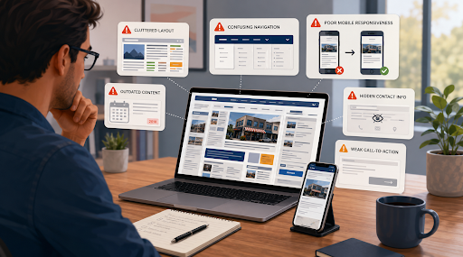
A website can be one of the most useful tools for a small business. It helps customers learn about services, compare options, find contact information, and decide whether a company appears trustworthy.
However, simply having a website is not enough. A poorly designed or outdated website can create confusion and may cause potential customers to leave before taking action.
Small business owners do not always need an expensive or highly advanced website. What matters most is that the site is clear, professional, easy to use, and focused on the needs of visitors.
Below are seven common website mistakes that small businesses should avoid.
1. Failing to Explain What the Business Does
One of the biggest website mistakes is not clearly explaining what the business offers.
When visitors arrive on the homepage, they should quickly understand:
- What products or services are available
- Who the business serves
- Where the business operates
- How the business can help them
A vague homepage can make visitors uncertain. Statements such as “Delivering quality solutions” or “Helping you achieve more” may sound professional, but they do not explain the actual service.
A better approach is to use a direct headline. For example, a cleaning company could say that it provides residential and commercial cleaning in a specific city. A consultant could clearly identify the type of businesses and problems they specialise in.
The main message should appear near the top of the homepage. Visitors should not need to scroll through several sections before understanding the purpose of the website.
Clear communication is more valuable than clever wording.
2. Using a Complicated Website Design
Some small businesses try to make their websites look impressive by adding too many colours, animations, images, fonts, and design effects.
This can make the website look crowded and difficult to use.
A professional design is usually simple and consistent. It should guide the visitor towards important information rather than distract them.
Use a limited colour palette that matches the business brand. Choose fonts that are easy to read and keep heading styles consistent across all pages. Leave enough empty space between text, images, and buttons.
Avoid using automatic videos, flashing banners, or unnecessary pop-ups. These elements may slow down the website and make it harder for visitors to focus.
The design should support the content. Customers usually visit a business website because they need information or want to take action. They are not visiting only to see creative effects.
A simple website can still look modern and professional when the layout is clean and well organised.
3. Making the Navigation Difficult
Visitors should be able to find important pages without confusion.
A website menu should use familiar labels such as:
- Home
- About
- Services
- Products
- Contact
- Frequently Asked Questions
Unusual or creative menu names may look interesting, but they can make it harder for visitors to understand where each link leads.
The menu should not contain too many options. If the website has several services, they can be organised under one main service category.
Important information should be available within a few clicks. Customers should not have to search through several pages to find contact details, prices, service descriptions, or business hours.
It is also helpful to include contact information in the website footer. This allows visitors to find it regardless of which page they are viewing.
Before publishing the website, ask someone unfamiliar with the business to test it. Give them a simple task, such as finding a particular service or sending an enquiry. Their experience may reveal navigation problems that the business owner has not noticed.
4. Ignoring Mobile Users
A large number of visitors access business websites from smartphones and tablets.
If a website is not mobile-friendly, the text may appear too small, images may not fit properly, and buttons may be difficult to tap. Visitors may need to zoom in or move the screen sideways to read the content.
These problems can quickly cause people to leave.
A responsive website automatically adjusts its layout according to the size of the screen. It should work smoothly on desktop computers, tablets, and mobile phones.
Test important website elements on mobile devices, including:
- Navigation menus
- Contact forms
- Call buttons
- Images
- Booking systems
- Product pages
- Maps
- Payment options
Forms should be simple and should not ask for unnecessary information. Phone numbers should be clickable so mobile users can call directly.
Small businesses considering a new website can research a website for small businesses that offers a clear and mobile-friendly starting point.
Mobile design should not be treated as an additional feature. It is a basic requirement for a modern business website.
5. Publishing Weak or Outdated Content
Website content has a major influence on how customers view a business.
Spelling mistakes, unclear descriptions, outdated prices, and incorrect contact details can reduce trust. Visitors may assume that the business is inactive or poorly managed.
Every page should provide accurate and useful information.
Service pages should explain what is included, who the service is for, and how the process works. Product pages should contain clear descriptions, prices where appropriate, and useful images.
Avoid filling pages with unnecessary text. Long paragraphs can be difficult to read, especially on mobile devices. Use clear headings, short sections, and simple language.
Website content should be reviewed regularly. Check whether:
- Services are still available
- Prices are current
- Staff information is accurate
- Contact details are correct
- Opening hours have changed
- Old promotions have been removed
- Links are still working
A blog can be useful, but only when the content is helpful and reasonably current. A blog that has not been updated for several years may make the website appear neglected.
It is better to have a few strong and accurate pages than many weak or outdated ones.
6. Hiding Contact Information
A website should make it easy for visitors to contact the business.
Some websites place contact information only on one page or require visitors to complete a long form. Others do not clearly display a phone number, email address, business location, or service area.
This creates unnecessary difficulty.
Contact details should appear in obvious locations, such as the header, footer, homepage, or contact page.
Depending on the type of business, useful contact options may include:
- Phone number
- Email address
- Contact form
- Physical address
- Service area
- Opening hours
- Online booking link
- Social media profiles
Businesses should offer contact methods that suit their customers. Some people prefer calling, while others may want to send a message or complete a form.
Contact forms should be short. Asking for too much information can discourage visitors. In many cases, a name, email address, phone number, and short message are enough for the first enquiry.
The website should also explain what happens after a customer gets in touch. For example, it could state that enquiries are normally answered within one business day.
Clear expectations can improve the customer experience.
7. Forgetting to Include a Clear Call to Action
A visitor may understand the business and like the services, but still leave the website without taking action.
This often happens when the website does not provide a clear next step.
A call to action tells the visitor what to do. Examples include:
- Request a quotation
- Book an appointment
- Call today
- Send an enquiry
- View our services
- Visit our shop
- Download the guide
- Sign up for updates
The most important call to action should be easy to see. It can appear near the top of the homepage and again after relevant sections.
The wording should match the visitor’s level of interest. For example, “Request a Free Quote” may be more suitable for a service business than “Buy Now.”
Avoid placing too many competing buttons in the same section. If visitors are asked to call, subscribe, download, register, purchase, and book at the same time, they may become confused.
Each page should have a clear purpose. A service page may encourage visitors to request a quotation, while a contact page may guide them to complete a form.
A strong call to action should feel helpful rather than aggressive.
Creating a Better Experience for Website Visitors
Many website problems are not caused by a lack of advanced technology. They are caused by unclear information, complicated design, poor organisation, or outdated content.
A small business website should make things easier for customers. Visitors should be able to understand the business, find the information they need, and take the next step without difficulty.
Business owners should regularly review their websites from a customer’s perspective. Ask whether the purpose is clear, the pages are easy to navigate, the content is accurate, and the contact options are visible.
Testing the website on different devices can also reveal problems with mobile layouts, forms, menus, and buttons.
Avoiding these common mistakes can make a website more professional and useful. A clear, trustworthy, and well-maintained website can support customer relationships and help a small business build a stronger online presence.