
In the UK’s professional landscape of 2026, a “one-size-fits-all” visual identity is a strategic liability. As digital spaces become increasingly crowded with automated content, the most successful brands are those that lean into Regional Character. Whether you are targeting the academic powerhouses of Cambridge or the rebellious innovators of Bristol, your brand must speak the local visual language to be taken seriously.
Designing for these two hubs requires a deep understanding of their contrasting “DNA.” One is built on deep-tech authority; the other on creative engineering and disruptive spirit. To bridge this gap, many firms are turning to a British digital marketing expert to ensure their messaging aligns with these nuanced regional expectations.
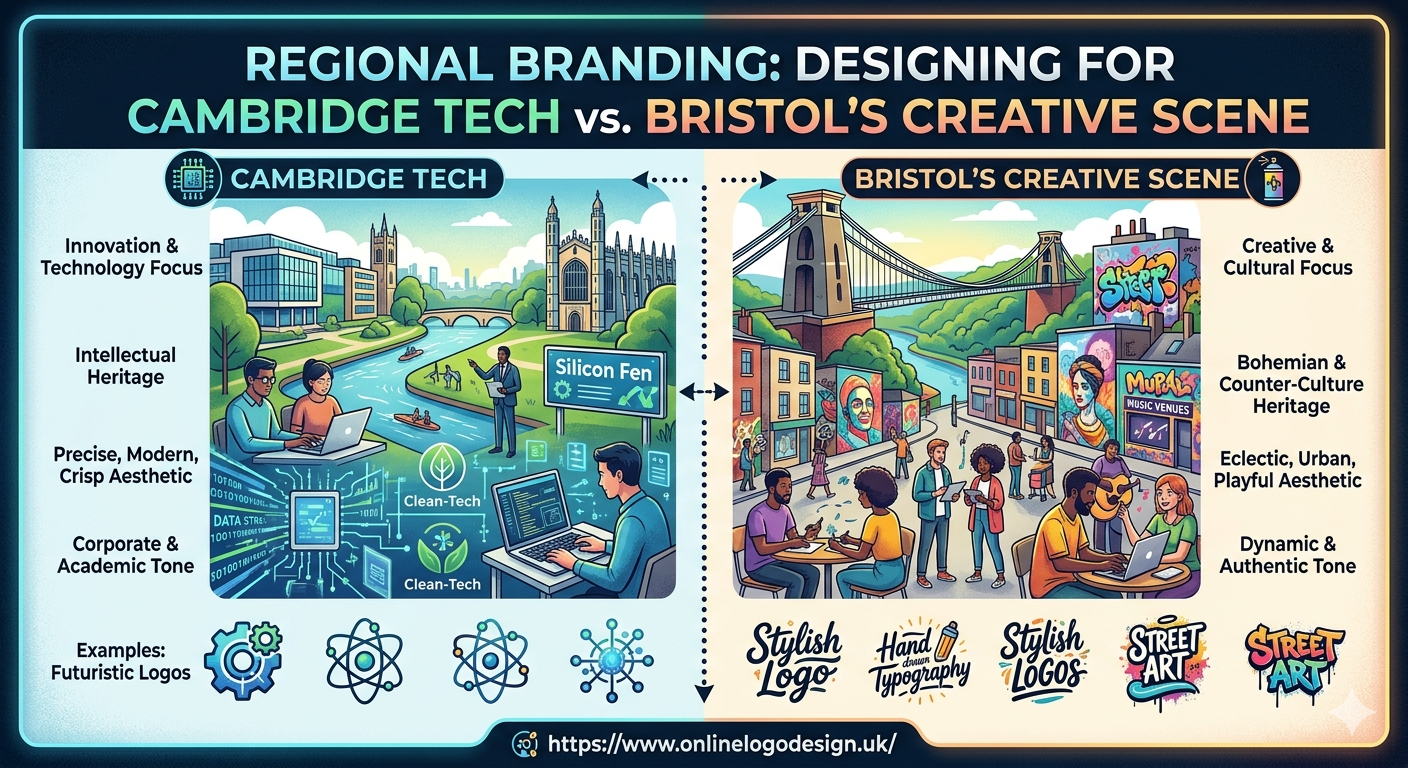
1. Cambridge: The “Silicon Fen” Aesthetic of Authority
Cambridge is the undisputed “Unicorn Capital” of Europe per inhabitant. The branding here isn’t just about looking modern; it is about looking verified. With a lineage connected to world-class research and heavy venture capital, Silicon Fen startups prioritize “Intellectual Credibility.”
Visual Cues for the Cambridge Hub:
- Precision Geometry: Logos often feature mathematical symmetry, molecular grids, or “data-first” icons that suggest scientific rigour.
- The “Deep-Tech” Palette: Expect to see “Oxford Blue,” slate greys, and “Cambridge Teal” colors that feel institutional yet forward-thinking.
- High-Contrast Clarity: There is no room for “fuzzy” branding here. Everything is sharp, readable, and structured.
For a tech firm in this region, a generic template won’t cut it. Investing in a high-caliber uk logo design service that specializes in B2B tech is essential. The goal is to look like a company that has been researching its solution for a decade, even if you only launched six months ago.
2. Bristol: The “Silicon Gorge” Creative Rebellion
Bristol and Bath represent a different kind of innovation. Known for aerospace, robotics, and world-class animation, Bristol’s “Silicon Gorge” is where high-tech meets “High-Street” grit. The branding here is far more tactile and human-centric than the clinical precision of the East of England.
Visual Cues for the Bristol Scene:
- Industrial Warmth: Bristol branding often uses earthy tones—terracotta, burnt orange, and charcoal—reflecting the city’s brick-and-mortar industrial history.
- Experimental Typography: While Cambridge stays “Safe Serif,” Bristol leans into bold, expressive, and even slightly “distressed” fonts that feel like they were hand-pressed in a workshop.
- Tactile Textures: In 2026, Bristol firms are leading the “Imperfect by Design” trend. Digital logos often incorporate grain, noise, or “scuffed” edges to signal that a human, not an algorithm, is behind the work.
3. The 2026 Shift: “Imperfect” vs. “Institutional”
The biggest trend of 2026 is the “Human-Made” signal. However, how this is applied varies by region:
- In Cambridge, the “Human-Made” signal is about Logic. It’s the hand of the expert clean, deliberate, and authoritative.
- In Bristol, the “Human-Made” signal is about Craft. It’s the hand of the creator messy, passionate, and authentic.
When a British digital marketing expert builds a campaign for these regions, they don’t just change the logo; they change the “vibe.” A Cambridge campaign focuses on ROI, data-backed evidence, and global scalability. A Bristol campaign focuses on community impact, creative problem-solving, and “The Story” behind the product.
4. Choosing Your Visual Strategy
If your business is operating at the intersection of these hubs, or looking to expand from one to the other, consider these three steps:
- Audit Your “Local Trust”: Does your current logo look like it was made in a vacuum? If you are moving into Cambridge, tighten your geometry. If you are heading to Bristol, add some texture.
- Simplify for Accessibility: In 2026, accessibility is a core design requirement. Ensure your regional colors meet high-contrast standards for mobile users.
- Invest in Specialty Design: Don’t use a global DIY tool for a local UK market. A specialized uk logo design service will know the difference between “Cambridge Blue” and “Bristol Orange” and why that distinction matters to your local investors.
Conclusion: The Power of Place
Innovation in the UK is no longer centralized in London. The regional hubs of Cambridge and Bristol have distinct personalities that demand distinct branding. By tailoring your visual identity to the specific “Vibe” of your hub, you move from being a “Guest” to being a “Leader.”
In the world of 2026, the brands that win are those that feel rooted in reality. Whether you choose the polished authority of the Fen or the creative grit of the Gorge, make sure your brand looks like it belongs to the people it serves.