

If you’re planning a refresh next year, you’re choosing more than paint and pulls you’re deciding how the space feels every single morning. The best 2025 updates are calm, tactile, and practical, with surfaces that age well and colours that make food (and people) look great. Below, you’ll find the key directions we’re building into projects at Wehebbenallesinhuis and how to translate them into keukenkasten that look current now and timeless later.
Confident colour blocks used with restraint
If you love colour, apply it like an accent wall from the waist down: a saturated island, a tall pantry block, or a coffee garage behind pocket doors. Burgundy, terracotta, and mineral teal are the bolder notes we’re seeing, especially in homes with plenty of daylight. Keep neighbouring runs quieter and let hardware stay simple. The impact comes from the block itself, not from competing details on kitchen cabinets.
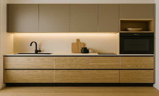
Real timber soft, not shiny
Wood is back in a big way, but with matte finishes and honest grain. Riftsawn oak, light walnut, and ash in natural or slightly smoked tones bring human warmth to otherwise minimal spaces. Vertical grain calms wide elevations; fine fluting adds shadow and texture without heavy pattern. A timber island with painted perimeter is the easiest path to balance. In 2025, this is the material move that stops kitchen cabinets from feeling clinical while keeping maintenance low.
Stone that travels from worktop to front
Slab doors in porcelain or sintered stone matched to the worktop create a monolithic, kitchen as furniture effect. It’s practical (wipe clean, scratch resistant) and incredibly striking when you carry veining across planes. Keep profiles thin and edges crisp, and pair with a warm neutral elsewhere so the composition doesn’t feel cold. Used thoughtfully, this treatment gives kitchen cabinets an architectural presence in open-plan spaces.
Metal accents with a softened hand
Polished chrome is taking a breather. Brushed nickel, burnished brass, and soft black finishes make handles, tapware, and frames read quieter, even when the shapes are strong. Consider a slim metal shadowline, a framed glass upper, or a micro beaded rail to punctuate long runs. The trick is moderation: one or two metal ideas, repeated. That keeps kitchen cabinets cohesive and lets the colour and grain do the talking.
Texture you can see and feel
Flat mattes remain, but 2025 leans into tactility. Nanotech laminates that self heal micro scratches, velvety lacquer, fluted timber, ribbed glass, and woven metal mesh all add depth in low light. Mix one feature texture with otherwise calm planes; for example, a fluted island with smooth perimeter doors, or ribbed glass on a single drinks cabinet. Texture is how you make kitchen cabinets photogenic at noon and atmospheric at night.
Nearly invisible hardware
Handleless isn’t the only path to clean lines. Slim pulls in a matching paint tone, integrated finger rails, or low profile edge pulls keep zones intuitive without smudgy push to open doors. Where you do go handleless, add soft close and upgraded runners so heavy drawers feel light. This is the quiet upgrade that makes kitchen cabinets feel smoother every single morning.
Light that flatters food (and faces)
Designers have finally stopped treating lighting as an afterthought. Expect continuous under cabinet strips with low glare, vertical LED profiles in tall pantries, and a small sensor in the bin drawer for midnight tidiness. Keep colour temperature warm (2700-3000K) so timber and stone look rich and people look rested. Good lighting is the multiplier: it makes every colour choice on kitchen cabinets read as intended.
Layouts that work harder with less
Trends aren’t only surface deep. Islands are getting slimmer but smarter, with double decker drawers, integrated cutlery blocks, and recycling bays that sort without stealing legroom. Pocket door “utility moments” hide toasters and espresso gear on a wipe clean worktop; flip the doors back and you’re in cafe mode, close them and the room exhales. Tall banks group ovens and warming drawers so prep surfaces stay clear. All of this supports the same aim: the most used items within shoulder to hip height, the seldom used up high, and the heavy things on full extension runners that glide. Do this and any finish you choose for kitchen cabinets behaves better.
Small kitchens, big presence
In compact rooms, tone on tone palettes make walls and fronts read as one, while a single textured note ribbed glass, fluted wood adds character. Choose lift up doors where swing space is tight, and shallow uppers (30-35 cm) to avoid “head bump.” A narrow larder pull out can make an impossible slice of space earn its keep. With these moves, kitchen cabinets feel tailored rather than squeezed.
How to build your 2025 palette (without second guessing yourself)
- Pick your base: a warm neutral or softly smoked wood.
- Choose one accent: a mid tone green/blue or a confident earth like terracotta.
- Add one texture: fluted timber, ribbed glass, or honed stone.
- Select metal in a single finish and repeat it.
- Light it warm and continuous, then edit.
This keeps the room coherent and lets your materials age gracefully.
Why design with Wehebbenallesinhuis
We don’t start with a door sample; we start with your light, your routine, and your space. Then we build a materials story that will still feel right on day 1,000: responsible cores, finishes you can maintain, and details you’ll touch every day. We mock up proportions, bring samples into your home, and install with people who care about the last five millimetres as much as the first drawing. The result: kitchen cabinets that look current in 2025 and still make breakfasts calm in 2030.
Discover the full range and possibilities directly at Wehebbenallesinhuis.