
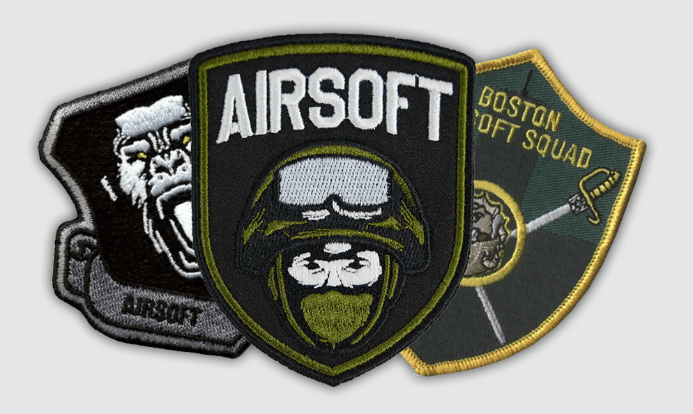
Walk onto any serious airsoft field in the U.S. and you’ll notice something before the first BB flies.
The patches.
Sleeves, plate carriers, backpacks—small embroidered badges quietly announcing who belongs to which squad. Some look sharp and deliberate. Others… well, let’s just say they resemble something designed at 2 a.m. with a free font and a questionable clip-art eagle.
That difference matters more than people think.
A patch isn’t just decoration. It’s a signal. Identity stitched into fabric. And when a team decides to create custom patches, they’re doing something subtle but powerful: turning a loose group of players into a unit that looks like it actually belongs together.
Sounds simple. It rarely is.
Start With the Story, Not the Artwork
Most teams jump straight into design software.
Bad move.
Before anyone touches Illustrator or Canva, ask a much more interesting question: What’s the personality of this team?
Are you the stealthy recon type who moves quietly through woodland fields? The loud, aggressive squad that storms objectives with unapologetic enthusiasm? Something sarcastic and self-aware?
Your patch should reflect that character.
Some of the most memorable custom airsoft patches lean into humor. Others channel military-inspired seriousness. A few go full absurdist—cartoon animals wielding rifles, inside jokes only the team understands.
There’s no universal formula here. The only rule is authenticity. If the design feels forced, people can sense it instantly.
Think of the patch as a flag. It needs a story before it needs a shape.
Keep the Design Simple Enough to Survive Stitching
Here’s a quiet truth about embroidery: it’s not great with microscopic detail.
A design that looks gorgeous on a digital screen can fall apart when thread enters the conversation. Fine gradients disappear. Tiny text turns into an unreadable blur. Thin lines collapse into awkward zigzags.
So simplify.
Strong patches rely on bold shapes, clear contrast, and limited colors. Imagine someone spotting your team from twenty feet away on a dusty field. If the design still reads clearly at that distance, you’re on the right track.
A few practical guidelines help:
- Stick to two to five colors whenever possible
- Use thick outlines around key shapes
- Avoid overly intricate typography
- Make sure the central symbol dominates the design
None of this kills creativity. It actually forces better design decisions.
And the result? A patch that looks intentional instead of cluttered.
Choose the Right Shape for the Team
Circles dominate the patch world. They’re safe. Predictable.
But airsoft teams aren’t required to play it safe.
Shield shapes feel tactical. Rectangles work well for unit names or call signs. Odd silhouettes—daggers, skulls, wings—can create a signature look if executed carefully.
Still, there’s a balance to strike. The more complex the outline, the harder it becomes to manufacture cleanly. Most experienced teams eventually settle into a few proven formats: circular emblems, shield badges, or simple rectangles.
And then they add personality through the artwork itself.
The shape should frame the design, not fight it.
Velcro vs. Sew-On: The Airsoft Reality
On casual jackets or denim vests, sewn patches make sense. Airsoft gear is different.
Plate carriers, combat shirts, and tactical backpacks are usually built around hook-and-loop panels. That’s why Velcro-backed patches dominate the field. They’re easy to swap, reposition, or remove entirely when a team wants to change things up.
Flexibility matters.
Some squads create multiple versions—main team insignia, morale patches, seasonal designs for special events. Velcro makes those rotations painless.
Still, quality matters here. Cheap hook backing wears out fast and starts slipping off gear during movement. Anyone who has crawled through brush for twenty minutes only to realize their patch vanished somewhere behind them understands the frustration.
If your team is investing in custom-made airsoft patches, make sure the backing is built to survive actual gameplay.
Pick Colors That Work in the Field
This part is strangely overlooked.
A bright neon patch might look cool online. In the middle of a woodland game, it becomes a glowing beacon. That might be fine for casual weekend matches, but more serious teams prefer colors that blend with tactical gear.
Muted tones—olive, tan, black, dark red—tend to dominate for a reason.
That said, there’s room for personality. Some teams deliberately choose striking color palettes so their patches pop in photos and on social media. It’s a trade-off between visual flair and practical camouflage.
Decide what matters more to your group.
Don’t Forget the Text (But Use It Carefully)
Team names can add clarity. They can also ruin an otherwise strong patch.
The trick is restraint.
If your squad’s name is long, abbreviate it. Use initials or a short call sign. Remember that embroidery handles large, simple lettering much better than small decorative fonts.
A good rule of thumb: if someone squints at the patch and can’t read the text immediately, it probably doesn’t belong there.
Sometimes the best decision is skipping text entirely and letting the symbol do the talking.
Test the Idea Before Ordering 100 Patches
Here’s a mistake plenty of teams regret.
They finalize a design, rush the order, and suddenly a box of 100 patches arrives… only for half the squad to say, “Hmm. I thought it would look different.”
Awkward.
Before committing to a large batch, print the design at actual size. Tape it to gear. Walk around with it for a day or two. See how it feels. Does the artwork still look balanced? Are the colors working?
That small reality check can prevent expensive revisions later.
Work With Someone Who Understands Embroidery
Not every designer understands how thread behaves.
There’s a technical side to patch production—stitch direction, border types, backing options—that influences the final result. Teams that collaborate with experienced patch makers usually end up with cleaner designs and fewer surprises.
Companies that specialize in embroidered work often guide teams through these decisions quietly in the background. The process tends to involve refining artwork, selecting materials, and adjusting details so the finished patch actually resembles the concept.
Good manufacturers don’t just print your design. They translate it into thread.
And the thread behaves differently.
The Patch Becomes Part of the Team
Something interesting happens once a team starts wearing the same patch.
It shifts how players see themselves.
The squad begins to feel more organized, more intentional. Recruits earn the right to wear it. Photos from matches suddenly look cohesive. The team identity moves from an abstract idea to something tangible.
All from a piece of fabric barely three inches wide.
That’s why people keep creating custom-made patches year after year. Not because patches are trendy, but because they quietly reinforce belonging.
You notice it when teams trade morale patches after events. When someone sews an older design onto a gear bag years later. When a worn patch tells the story of dozens of matches played together.
It becomes a small artifact of shared experiences. And honestly, that’s the whole point.