

A focus room is a place where your eyes and mind should settle, not bounce. Whether it’s a home office, study corner, reading nook, or a desk area in a shared room, the art on the wall can either support steady attention or pull it away. This guide is about choosing canvas prints and wall art prints with quiet tones and subtle movement—pieces that add character without turning your workspace into visual noise.
What Makes a Focus Room Feel Calm
Visual quiet is a design choice
When you sit down to work, your brain keeps scanning the space for cues. Strong contrast, busy shapes, and loud color can keep that scanning active. A focus-friendly wall chooses calmer color, cleaner composition, and shapes that feel organized. The goal isn’t an empty room; it’s a room where your attention stays on what matters.
Where distraction usually starts
Distraction often comes from too many competing focal points: a crowded gallery wall, high-gloss glare, harsh color clashes, or art that feels like it needs constant “reading.” In a focus room, the best artwork feels present but not demanding—like a steady background rhythm.
- Too many tiny details that keep pulling your gaze around the canvas
- High-contrast patterns that look sharp from across the room
- Several bold pieces fighting for attention on the same wall
- Glossy reflections from windows and overhead lighting
Quiet Tones That Support Concentration
Neutrals that keep the room steady
Quiet tones do not mean “boring.” Neutrals can look warm, clean, or soft depending on the mix: sand, stone, off-white, warm gray, charcoal, and muted clay. These tones work well in a workspace because they sit back instead of jumping forward. If your desk setup already has strong colors (books, screens, tools), a quieter canvas helps the whole room feel more ordered.
Soft contrast vs. hard contrast
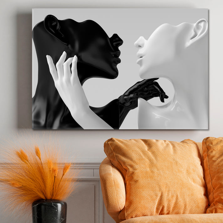
Contrast is not the enemy—hard contrast is. A black-and-white piece can still work if the transitions are soft and the shapes are simple. If you want something that reads calm from a distance, look for gentle shifts in tone rather than sharp edges. The piece should feel consistent whether you’re sitting at your desk or walking by.
One palette, fewer surprises
A focus room benefits when the wall art follows one palette. If the canvas stays in a close set of tones, your attention doesn’t have to keep re-adjusting. A small accent color is fine—just keep it limited, like a thin line, a small shape, or a soft wash of color rather than a large bright block.
Subtle Movement That Keeps the Mind Engaged
Motion without noise
Subtle movement is the sweet spot for a focus room. Think gentle curves, flowing lines, soft gradients, and layered shapes that suggest motion without shouting. This kind of movement can feel energizing during long work sessions, but it won’t pull you into constant visual analysis.
Linework and flowing forms
Linear art can feel like structure. Curves can feel like ease. A piece that combines both—clean lines with small shifts—often works beautifully near a desk. From a distance, it reads simple. Up close, it offers depth without turning the wall into a puzzle.
Nature cues that don’t take over
Nature-based themes can support focus when they are quiet: misty horizons, gentle water movement, distant hills, soft skies. If you love organic forms, choose artwork that keeps the scene simple and avoids overly busy foreground detail.
Best Art Styles for Focus Rooms
Minimal forms for distraction-light walls
If your goal is a clean visual field, start with minimalist wall art. Look for large shapes, open space, and low-contrast color. These pieces can make a workspace feel more organized without making the room feel empty.
Soft abstract work that stays supportive
Abstract art is a strong option for study rooms because it can create mood without telling a literal story. A well-chosen abstract art print with quiet tones and gentle motion can keep the room interesting while still letting your attention stay on your tasks.
Work-ready themes that fit a desk space
If your room is a dedicated workspace, choose art that matches the setting: clean compositions, ordered shapes, and stable color. For wall pieces designed to suit work areas, browse office wall art that supports a professional, steady look without adding visual clutter.
Choosing the Right Size Without Stealing Attention
When large wall art works best
Large wall art can be excellent for focus rooms because it reduces “fragmentation.” One larger canvas with calm tone is often quieter than multiple small pieces. Choose a size that feels balanced with your desk or seating area. The piece should anchor the wall, not overpower it.
One statement piece vs. a simple set
If you love sets, keep them consistent: same palette, similar visual weight, and enough breathing room between frames. A two-piece or three-piece arrangement can work well if each panel stays simple. Avoid mixing different subjects or strong competing colors in the same wall zone.
Placement in Focus-Friendly Spaces
Above a desk
Above a desk, center the art and keep the composition stable. If the art has motion, it should flow smoothly rather than zig-zag. The best desk placement keeps your main sightline calm when you look up from your screen.
Side-wall placement
If you’re sensitive to distraction, place art on the side wall so it’s not directly in your forward gaze. You still get the mood of the piece, but it won’t constantly compete with your work.
Reading nook and study corner
In a reading nook, the viewing distance is usually closer, so the art can carry a bit more detail—just keep it soft. Gentle textures and layered forms work well near a chair, especially when the palette stays within quiet tones.
Canvas Prints vs. Paper Prints for a Calm Finish
Why canvas can feel softer on the wall
Canvas texture often reduces harsh shine and adds a softer surface feel in a workspace. It can look calm under changing light, especially when the artwork uses gentle transitions rather than sharp, high-contrast blocks.
A clean presentation matters
A focus room benefits from tidy edges and a stable look. Artesty canvas prints are made on natural canvas with high-quality ink, then hand-stretched on 1.5-inch (3 cm) wood panels for a clean, ready-to-hang finish. That structure helps the artwork look crisp on the wall without needing extra framing choices.
How to Build a Cohesive Focus-Room Look
Repeat a small set of tones
Pick one main tone family and repeat it across the room: the art, a desk mat, a lamp shade, or a shelf object. Repetition makes the room feel more settled.
Match the art’s energy to your work style
For deep work, choose fewer shapes and softer contrast. For creative work, you can add a little more motion—just keep it controlled. If you want structured themes that still feel calm, a business-focused print can fit well. For example, business wall art can bring clean lines and ordered design into a workspace without making it feel busy.
- Start with your wall zone: desk wall, reading wall, or side wall
- Choose a quiet palette: close tones, low contrast
- Pick a motion type: soft curves, layered shapes, gentle gradients
- Choose size by furniture: keep the piece proportional to desk or chair width
- Limit the count: one strong canvas or a small, consistent set
- Test glare: place art where light won’t bounce into your eyes
Quick Checklist Before You Choose
- Color: quiet tones with controlled contrast
- Composition: open space, clean shapes, no crowded detail
- Motion: smooth flow, not sharp jumps
- Scale: balanced with desk, chair, and wall width
- Placement: supports focus in your main sightline
FAQs: Art for Focus Rooms
1) What kind of wall art works best in a focus room?
Choose wall art prints with quiet tones, clean shapes, and controlled contrast. Abstract and minimal styles often work well because they add mood without demanding attention.
2) Is abstract art a good choice for a study room?
Yes. Abstract art can feel calm and supportive when it uses soft movement and a limited palette. Avoid pieces with many tiny details if you’re easily distracted.
3) Should I choose one large canvas or several smaller prints?
One larger canvas can look calmer because it reduces visual breaks. If you prefer multiple pieces, keep the set consistent in color and visual weight.
4) What colors help with concentration?
Muted neutrals and low-contrast palettes often support focus: warm gray, soft beige, charcoal, and gentle earth tones. A small accent color can work when it stays limited.
5) Where should I hang art in a home office?
Common placements include above the desk, on the side wall, or behind a chair. If you want fewer distractions, keep the most detailed art out of your forward gaze.
6) How high should I hang a canvas above a desk?
A helpful rule is to keep the bottom edge of the canvas a comfortable distance above the desk so it feels connected to the furniture, not floating too high.
7) What style looks clean in small workspaces?
Minimalist designs and quiet abstract pieces often look clean in small rooms because they avoid clutter and keep the wall feeling open.
8) Can nature themes support focus?
They can, especially when the scene is simple. Soft horizons, gentle water cues, and calm skies can add a grounded feel without taking over the room. If you like organic themes, try nature canvas prints that keep the composition quiet.
9) How do I keep a gallery wall from feeling distracting?
Limit the palette, keep spacing consistent, and choose pieces with similar visual weight. Avoid mixing many different subjects or bold colors in one cluster.
10) Do textured canvases look better for focus rooms?
Canvas texture can soften the look of the artwork and reduce harsh shine, which many people find helpful in work areas with changing light.
11) What if my room already has strong color?
Use art that stays within quiet tones so it balances the room. Let the room’s color be the accent and keep the artwork more controlled.
12) How can I make my workspace feel more organized with art?
Choose one piece that anchors the wall, repeat its tones in a few small objects, and avoid adding many competing focal points.
13) What’s the best art choice for long desk sessions?
Pick art that reads calm from a distance: fewer shapes, smooth motion, and a close palette. This helps your eyes rest when you look up.
14) Is it okay to use bold art in a focus room?
Yes, if it’s one controlled piece and the rest of the room stays calm. Keep the art’s composition clean and avoid mixing multiple bold works on one wall.
15) How do I choose art that feels professional in a workspace?
Look for stable compositions, clean lines, and controlled color. A piece that fits a work setting can support focus while keeping the room polished.
Recommendations for Building a Focus-Friendly Wall
If you want a quick path to a calmer workspace, use these choices as a starting point:
- Choose one main palette for the room and keep art within that range
- Pick a single larger canvas for the main wall to reduce visual breaks
- Use gentle motion (soft curves, layered shapes) instead of sharp patterns
- Place art where glare from windows and overhead lighting won’t hit your eyes
- Keep the busiest art away from your main sightline
How We Print and Prepare Orders at ArtestyPrinting process
- We check the artwork file for clean detail and correct sizing
- We print using high-quality ink on natural canvas for clear, steady color
- We inspect the print surface to confirm the final look matches the intended tones
- We hand-stretch the canvas over 1.5-inch (3 cm) wood panels for a solid form
Order preparation process
- We perform a final visual check before packing
- We protect corners and surfaces to help prevent marks during transit
- We pack the canvas carefully so it arrives ready to hang
50 Keyword Ideas for This Topic
focus room wall art, office wall art, minimalist wall art, quiet tone wall decor, subtle movement art, abstract art print, canvas wall art, canvas prints for office, wall art prints for study, calm wall decor, neutral wall art, muted wall art, soft abstract wall art, minimal wall decor, work from home decor, reading nook wall art, study corner decor, desk wall art, above desk wall art, large canvas wall art, modern wall art prints, workspace wall decor, home office canvas, office canvas prints, simple abstract canvas, soft line art print, flowing abstract wall art, gentle curve wall art, low contrast wall art, quiet abstract canvas, neutral canvas prints, calming office decor, study room wall decor, library corner decor, creative studio wall art, desk setup wall decor, clean wall art, quiet wall prints, abstract canvas for office, minimal canvas print, soft tone canvas print, subtle abstract print, wall hanging for office, artwork for focus, room decor for workspace, modern wall decor for office, wall art for productivity, desk area wall art, quiet wall art for study
17 Blog Article Ideas Related to Focus Rooms
- How to Choose Office Wall Art That Doesn’t Distract
- Minimalist Wall Art: A Practical Guide for Workspaces
- Quiet Tones for Home Office Decor: Color Rules That Work
- Desk Wall Layout Ideas: One Canvas vs. A Small Set
- Reading Nook Wall Art: Soft Motion, Low Contrast
- Study Corner Decor That Feels Clean and Organized
- How to Avoid Glare When Hanging Canvas Prints
- Abstract Art Prints for Focus: What to Look For
- Large Canvas Prints in Small Offices: What Works
- Wall Art Prints for Creative Workspaces Without Clutter
- How to Match Wall Art With Desk Materials and Shelving
- Line Art vs. Abstract Shapes: Which Helps Focus More?
- How to Build a Calm Gallery Wall in a Work Room
- Neutral Wall Art: Warm vs. Cool Tone Choices
- Art Placement Tips for Shared Work-and-Living Rooms
- Minimal Color Accents: How Much Is Enough?
- Quiet Nature Prints for Work Areas: Simple Scene Rules
12 Characteristics of Focus-Friendly Wall Art
- Quiet tones
- Controlled contrast
- Clean composition
- Open space in the design
- Few focal points
- Smooth motion cues
- Limited accent color
- Readable from a distance
- Looks calm under different lighting
- Balanced scale for the wall
- Works with desk and shelving lines
- Feels steady during long work sessions
9 Customer Decor Stories (Focus Room Edition)
- One-wall reset: A buyer replaced several small frames with one quiet abstract canvas above the desk and felt the room look more ordered.
- Reading corner upgrade: A soft-toned print near a chair made the space feel calmer without changing furniture.
- Side-wall solution: A customer moved the boldest piece to a side wall and kept the main desk wall low-contrast for fewer interruptions.
- Shared-room balance: In a work-and-living room, a neutral canvas tied together the desk area and the seating area without adding clutter.
- Light control: A buyer chose a canvas finish to reduce glare from a nearby window and found it easier to work during the day.
- Color limit win: A customer picked art with one small accent tone and repeated it with a desk accessory for a clean look.
- Large piece, fewer distractions: One large canvas replaced a busy gallery wall and made the space feel less “noisy.”
- Creative studio focus: A simple flowing form print kept the room motivating but didn’t compete with tools and materials.
- Better video-call background: A calm abstract canvas behind the chair made the room look clean and professional on camera.
A Suggestion Many People Miss
Before you buy, take a photo of your wall from your seated desk position. If the art you’re considering looks “busy” in that photo, it will likely feel busy during work. Choose a piece that reads clean from where you actually sit, not only up close.